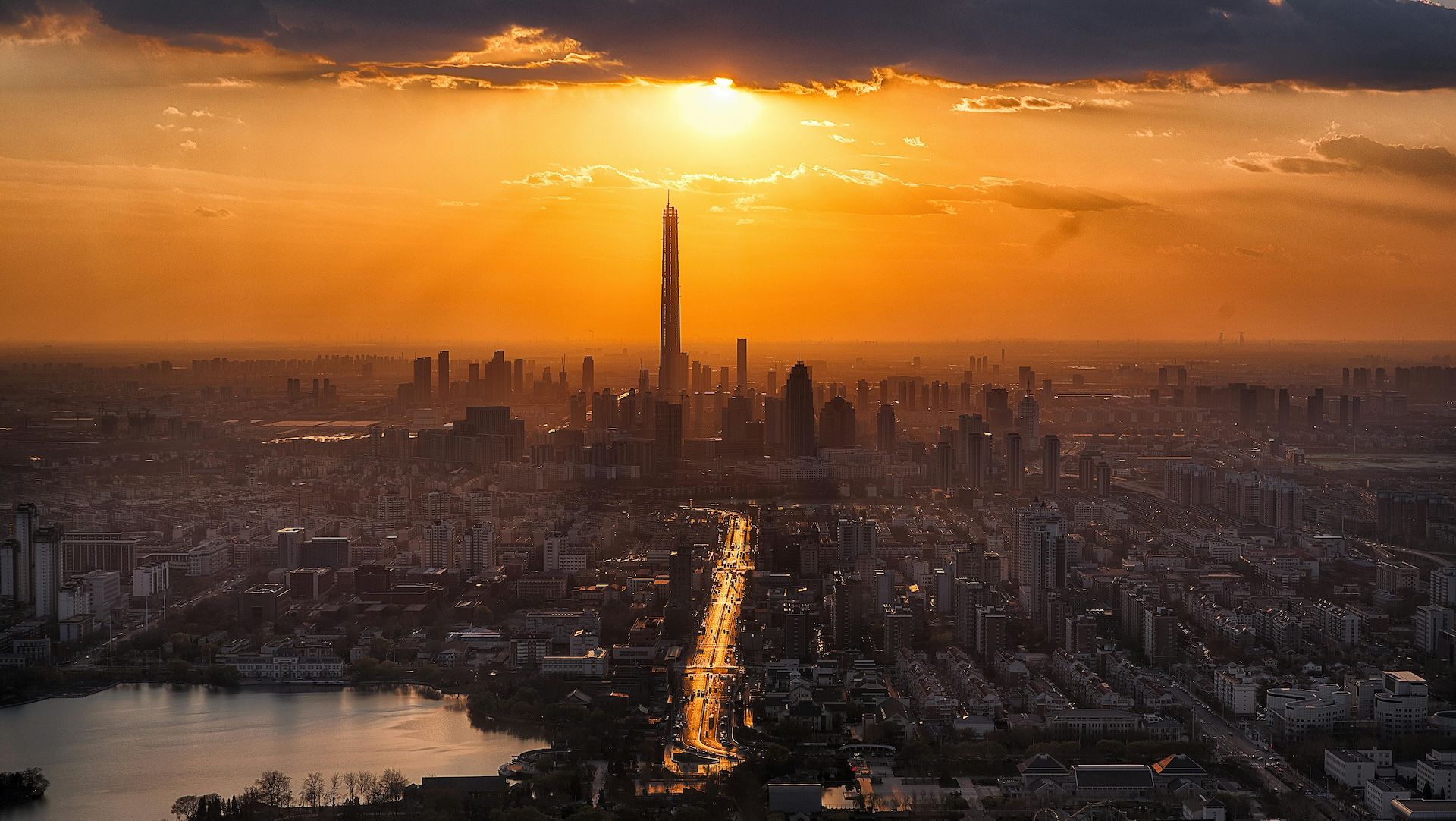
Carnegie Mellon University’s Amy Gottsegen and Randy Sargent on helping people answer the question: Is it safe to breathe outside today?
 In this ongoing Climate TRACE series, we interview individual coalition members, contributors, and collaborators about their work. We recently talked with Amy Gottsegen, Software Engineer, and Randy Sargent, Visualization Director, both at Carnegie Mellon University's CREATE Lab, whose atmospheric modeling powers Climate TRACE's air pollution tracking and plumes animation tool.
Tell us a little about the plumes tool. What it is and why is it important?
Amy Gottsegen: The plumes tool shows people how air pollution moves through their community, so they can see where and when the risk of it affecting their health is highest. Using the map, people can watch the likely flow of harmful particulate matter (PM2.5) over a 24-hour period as it travels from the industrial facilities that contribute to climate change and into the air that people in more than 2,500 cities breathe.
We zeroed in on PM2.5 because it's a major threat to human health. A large body of research documents its risks, including respiratory, cardiovascular, and neurological impacts, and nearly 9 million early deaths globally are attributed to PM2.5 pollution every year. It's also pervasive: PM2.5 pollution is common to any combustion process, so it shows up across almost every single sector, with major sources including fossil-fuel burning power plants, heavy manufacturing sites, ports, refineries, and mines.
The plumes tool is newly global thanks to your partnership with Climate TRACE, but its origin story started a decade ago in Pittsburgh (Pennsylvania, USA). What was the initial motivation that prompted the work?
Randy Sargent: If you've ever had to rush to the ER because of asthma, not sure if you're getting enough breaths between here and there, then you know this work is incredibly personal. It's personal for me in that way. So about 10 years ago, I started to think seriously about what we could actually do about it.
At that time, CREATE Lab had already been working on capturing visible evidence of air pollution, in the form of haze cameras we installed on the tops of some towers. The idea was to have these cameras help demonstrate, for instance, "Today is not a good day to breathe because it's so smoggy." The technology let you zoom in on different industrial facilities. Working with those cameras got us out into communities, and that's when parents started coming up to ask the question that inspired the plumes tool: "Is it okay for my kids to play outside today?"
It's hard to walk away from that question and say, "Oh, that's not important to answer." It's critically important to answer it. Parents need to know how they can preserve their children's health... should they keep them inside, and if so, for how long? Should they try to move somewhere else?
So we didn't walk away from those questions. Instead, we started keeping track of what people in the communities were noticing, tallying whenever people smelled pollution because, like a lot of pollution sources, the worst ones in Pittsburgh are related to coal --- and it does smell.
But being able to walk outside and smell pollution in the air is different from being able to gather that information over time and across a community and use that knowledge to drive change. For years, if someone --- myself included --- smelled that pollution was worse on a given day, they'd call the county health department, which, in Pittsburgh, is delegated by the Environmental Protection Agency as an authority for various environmental issues. But there was always a runaround: 'We don't know where that came from,' or even, 'That facility is not causing problems...maybe it was someone working on the street next door..."
Of course, people who'd lived there long enough knew better. They knew it was causing problems, they just couldn't demonstrate it. They needed evidence they could bring to bear to make a change.
The first round of evidence came from those smell reports I mentioned. And the more that people shared their observations, the more people got involved --- and the more their stories kept adding up. Soon we were able to document their stories with a map showing widespread impact; for example, we could say "200 people on this one day reported smells in a given pattern." Such tangible evidence made it much harder for an agency to tell concerned community members not to worry. Instead, community members could point to the map and say, 'no, actually here it was, and here's the wind that brought it from this particular facility.'
What were early signs that this tool could pay off in terms of positive change?
RS: The first parents who asked us for advice lived across the river from the Shenango Coke Works plant. We worked with them to document the pollution, including with video, and the evidence we compiled was damning. When a regional EPA representative came to a community meeting, we were able to stand up with evidence showing that the pollution was not acceptable. The county health department was also there, and they agreed then and there to re-evaluate an earlier permission they'd granted, which had basically allowed the facility to exceed its permit while it supposedly worked to bring pollution down to the permitted level.
Then within a month of that meeting, the out-of-state company that ran the coke works facility announced it was shutting the plant down. And what we know now is that after it did, the number of kids going to the ER for asthma went down by a factor of five year-over-year according to county health department numbers. Dr. Deborah Gentile both studies, and treats, pediatric asthma in our area. She had been studying and treating pediatric asthma around Shenango before it shut down and continuing after. Her research showed 25% fewer kids were diagnosed with asthma the year after closure --- and if 25% fewer children are developing it each year, this would obviously lead to a lifetime of benefit for those children who never developed it. Two more recent research efforts tie the shutdown to reductions in emergency room visits across all ages for both respiratory causes and also cardiovascular causes.
From that early victory a larger movement was born... How did you grow from those early smell reporting tallies to today's plumes tool, where millions of assets around the world can now be pinpointed down to their individual plumes?
AG: It's been quite a growth journey, but the centering goal was always to help validate the reports that advocates and residents were making. In the beginning, that work took the form of a Google Doc where people shared observations. Then we moved in sequence to develop a scalable mobile application that could model pollution plumes based on crowd-sourced data from SmellPGH, NOAA weather models, air quality monitoring data from regulatory and citizen-owned networks, and emissions inventories.
This included working with community groups to model plumes for specific incidents, as well as using pollution plumes on average over a year to determine good locations for monitors to pick up the brunt of the pollution coming out of a given facility. Along the way we did a lot of community iteration and outreach to make the tool something that's now easily and widely used in Pittsburgh. Plume Pittsburgh went live in 2021 and was the model for the plumes tool we've since made with Climate TRACE.
Before we knew about Climate TRACE data, we got emissions inventories from regulatory agencies and industry self-reporting. In Pittsburgh, for example, facilities have to file permits that list how much particulate matter they're allowed to emit in a year. That was the best thing we had to go off then.
Everything changed in early 2024 when we got connected with Climate TRACE folks, some of whom had seen the pollution plumes and had the idea of connecting Climate TRACE data with our emissions visualization technology. Having access to monthly datasets that are consistent globally for so many different types of facilities has been amazing because there are usually different regulatory agencies for every single city and state and country. Without Climate TRACE's data, we never could have made this global tool.
How does the Climate TRACE version plumes tool work today?
AG: Today, when you go to the plumes tool and select an urban area anywhere in the world, you'll see the PM2.5 pollution coming out of local facilities and moving across that city. By default, the first animation reflects "prevailing conditions," meaning how pollution typically moves on an average day. You can also choose "worst conditions" days, when weather traps pollution close to the ground and increases health impacts.
Weather plays a huge role in how pollution moves, which is why we show both types of days. On an average day, winds usually push pollution along and help clear it from ground level. But on worst-condition days, temperature inversions can hold pollution in place --- something that happens often in places like Pittsburgh. In some regions the landscape itself, like valleys or basins, can also keep pollution from dispersing. Showing both views gives a clearer picture of what different communities actually breathe.
To generate these animations, the tool draws on rich weather modeling data from NOAA's High-Resolution Rapid Refresh (HRRR) model: things like wind direction, wind speed, pressure, and humidity. It also incorporates key details about each pollution source, including emissions levels and stack height, so the model reflects real-world conditions as closely as possible.
What's next for the plumes tool, and how do you see it being used to make an impact?
AG: We're excited in the future to extend this work to create annual 'footprints' that show long-term exposure around facilities. That will let us quantify, for example, how much PM2.5 communities experience over a year and connect that to health studies to make the impacts clearer over time.
As far as long-term vision for the tool, it comes back to the story Randy shared earlier about the coke works. That really was core to our understanding of how this kind of data visualization can drive change. We've continually found that people on the front lines of industrial pollution already know the impacts, but they're just not being listened to. My hope is that being able to visualize the pollution they experience gives them a tool to be heard, and the validation they need to keep pushing for change on a bigger stage.
RS: We all pay a global price for greenhouse gases, but it's so important to be able to connect that with the local health costs communities and regions face from the same sources. Many industries contribute to both, causing harm both locally and globally. This tool helps everyone connect those dots --- from policymakers to industry leaders to community members --- and ideally use that understanding to drive meaningful change for social good.
Interviewed by Daisy Simmons. This interview has been edited for length and clarity.