Plumes Frequently Asked Questions
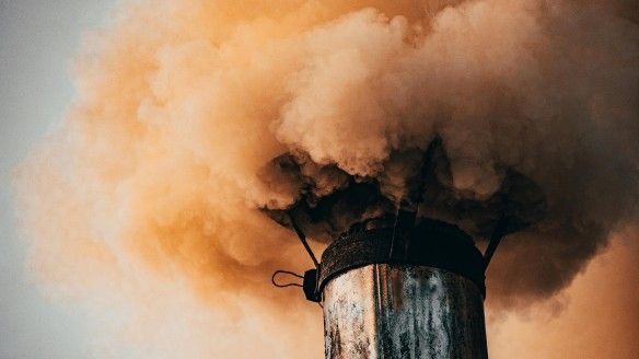
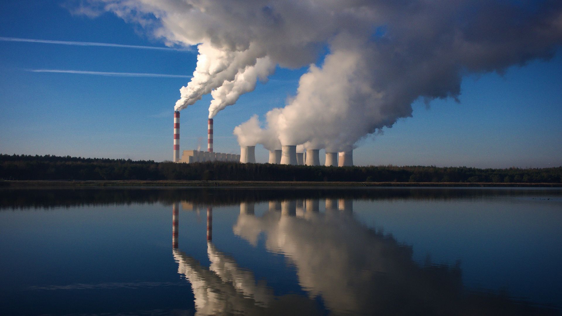 Climate TRACE has developed a global air emissions dataset that provides unprecedented transparency into greenhouse gas (GHG) and non-GHG emissions. To further illuminate the direct impacts of air pollution, Climate TRACE has released plumes data and a web-based tool to visualize this data. This new platform moves beyond annual inventories to provide a current, intuitive look at how harmful particulate matter (PM2.5) from major industrial sources travels and disperses, empowering communities, policymakers, and journalists to connect specific sources of pollution to local air quality.
What is the Climate TRACE Plumes tool?
The Plumes tool is a groundbreaking public platform that, for the first time, visualizes a day's worth of air pollution from 9,560 of the world's largest industrial and power facilities located in 2,572 major urban areas. By combining satellite data with advanced atmospheric modeling, the tool makes the microscopic threat of harmful particulate matter (PM2.5) visible to all. It is a major breakthrough in environmental data transparency, shifting the conversation from abstract emissions totals to the tangible, daily reality of air pollution.
What is a "plume" in this tool?
A plume is a visualization of how PM2.5 particles emitted from a single facility travel through the atmosphere over 24 hours. It is not a direct measurement but a sophisticated scientific model showing the likely path and dispersion of pollution. We use that day's specific weather, as well as that day's share of emissions from the monthly emissions that Climate TRACE tracks for every facility.
What do "prevailing conditions" vs "worst conditions" represent?
The tool visualizes pollution on representative days, allowing users to switch between "prevailing conditions" and "worst conditions".
To determine these days, our systems modeled how pollution from each facility spread under the specific weather patterns for every day of 2024. For each day, we calculated the total population exposure by combining population data with these maps of how pollution spread on each day.
-
"Prevailing conditions" shows a representative day demonstrating how communities in an area were estimated to have been exposed most often to pollution from these sources throughout the year.
-
"Worst conditions" shows the single day of the year when communities in an area are estimated to have been exposed to the largest amounts of PM2.5 pollution.
What is a "footprint"? Will the data be available?
A footprint is the quantitative summary of a plume's impact. While the animated plume shows the pollution's path through the atmosphere, the footprint collects all of these moments into a static 2D grid that shows the average concentration of PM2.5 pollution on the ground over an entire year (in micrograms per cubic meter, µg/m³) from a given source. We have computed footprints for 2024.
While the footprints for all 9,560 assets are being generated as part of this initiative, direct access for external analysis is not yet available. We will have a clearer timeline for access to footprint data following the initial launch.
How are the plume data created?
The tool is powered by atmospheric modeling from researchers at Carnegie Mellon University's CREATE Lab, using the HYSPLIT (Hybrid Single-Particle Lagrangian Integrated Trajectory) model. Using facility-level PM2.5 emissions data from the Climate TRACE inventory, the team models the dispersion of pollution for major emitting facilities globally. For the current release, CMU CREATE Lab modeled the dispersion of average monthly PM2.5 emissions using weather information about each day in 2024.
What sectors are included in the tool?
The initial launch includes plumes for power, fossil fuel refining, heavy manufacturing, shipping, and mining within urban areas worldwide.
What can this tool tell us about health impacts?
The tool provides powerful new evidence for understanding pollution exposure, which is the first step in assessing health impacts. The tool vividly illustrates how plumes from industrial sources travel over densely populated areas.
However, directly quantifying health outcomes (e.g., "X hospitalizations were caused by this factory or plant") is a complex process that requires additional research. Climate TRACE is actively seeking to partner with public health institutions to connect our exposure data with established health outcome models.
How accurate is the plume visualization?
The plumes are a highly sophisticated scientific model, not a direct, real-time measurement. They represent the most likely path of pollution based on the best available data, but there are important caveats:
-
They assume continuous emissions: Our model smooths out a facility's emissions to a continuous monthly average, since real-time, hourly data is not available. Therefore, most of the minute-by-minute variability you see in the plume is caused by wind and weather, not by the facility increasing or decreasing its actual emissions.
-
They are source-specific: The tool shows PM2.5 pollution only from the industrial sources we are modeling. It does not represent the total air pollution in an area, which may include pollution from other sources like traffic or wildfires.
-
They depend on input data: The quality of the plumes is dependent on the accuracy of the input data, including the Climate TRACE emissions estimates and the meteorological data used for the atmospheric model (HRRR 3km) in the U.S., but lower resolution (GFS quarter-degree, or 25--28km) in the rest of the world.
Who should use this tool?
The Plumes tool is designed to empower a wide range of users to take action:
-
Community organizers and advocates can use the tool to provide clear, visual evidence of pollution sources affecting their neighborhoods, helping them build data-driven campaigns for cleaner air and environmental justice.
-
Journalists can investigate and report on corporate pollution, the effectiveness of air quality policies, and the disproportionate burden of pollution on vulnerable communities.
-
Policymakers and regulators can identify pollution hotspots, understand cross-border pollution impacts, and develop more targeted regulations to protect public health.
-
Public health researchers can use the data to correlate pollution pathways with health outcomes, identifying areas for further study and intervention.
-
Concerned citizens can finally see and understand the sources of air pollution in their own communities, enabling them to engage more effectively in local decision-making
What does "Approximation of Surrounding Ports" mean?
When you select a port on the map, you will see the message "Approximation of Surrounding Ports." This is to provide important context for how these specific locations are mapped.
In many parts of the world, a major port is not a single point but a large area with dozens of individual docks and terminals where ships are active. Rather than creating hundreds of points for one port complex, our model represents this entire area of activity with a single, approximate location.
Why does the point sometimes appear inland?
Calculating a central point for a curved or complex coastal area can sometimes result in a location that appears inland, away from the water. We are aware of this limitation and want to be transparent about it.
We believe that including this data, even with its current limitations, is crucial. Ports are a substantial source of PM2.5 pollution affecting many communities, and omitting them would paint an incomplete picture of local air quality. We are actively working on a more accurate way to represent these distributed sources in future updates.